 "Beaver Dam Island Reflections"
24x18 oil on linen
 This is the beginning stages of "Beaver Dam Island Reflections". I started out with a wash of transparent oxide red to map out my large shapes and where I wanted them to be placed. I believe I also used aliz. and viridian to map out my darks. I spend a lot of time thinking of how I best want to portray what it is I want to say in my painting. For me, It is critical to have a strong start in my paintings.
 Getting away from my block in (above) and making certain it's where I want it to be, I begin to mass in my large shapes in it's areas of lights and darks.
 Most of the time I like to work up my studio pieces by getting my large massing in fairly soon in the process. So, I wanted to get the water mass covered. One of the main reasons I do this is because color is relative to it's surroundings and until I get the color close to where I need it to be it would be difficult to fine tune the rest of my painting.
 Getting started on my reflections here. I really love painting reflections. I spent years just studying the river and how to capture it with paint (I'm still workin' on that by the way!) :) The one thing I've learned to 'usually' be true with a clear reflection is that your darks almost always reflect a bit lighter (and grayer) and your lights almost always reflect a bit darker (and grayer) and how ever clear it might appear there is typically some kind of subtle half tone color in between the two. The best thing to do though is to just squint down and make your own judgement!
 Building my texture in foliage and having fun doing it!
 I worked back and forth trying to correct the large shape of the tree mass until I was happy with it.
 At this point, I'm getting close. So, I start slowing down quite a bit. Taking many breaks to keep my eye as fresh as possible. Always telling myself that each stroke at this point has to help the painting. If it hurts it, it's obvious not to put it in but if it doesn't hurt OR help, it's not necessary either. Easier said than done. I think this is about when I had to stop and go get my kids from school. Another good reason to have kids, keeps the eye fresh! ;)
 Awe, now for restraint! Tough when you like lily pads so much! They make me kinda happy so it's tough to stop when laying in the final notes which are symbols for lily pads. That was kind of like just taking 2 bites of cake when you have a huge piece in front of you! Just enough.
 Final
Final
 "Lily Pads And Blue Skies"
This past week I wrapped up 2 new studio paintings that are near and dear to my heart. Like many painters, I most often find my surroundings the inspiration for my work, often for me this is the place where I grew up. I'm fortunate enough that place still exists and I have complete access to it. As I grow as an artist, I'm finding myself compelled to paint the places I have fond memories of. I'm finding myself using the place as a memory trigger that allows me to go well beyond the 'subject' that is before me, but rather paint my emotional response and memory to a moment as my impression.
The paintings below are of the beaver dam behind my Dad's house. I spent many years of my childhood exploring this habitat and enjoying it's beauty.
This is the beginning stages of "Beaver Dam Island Reflections". I started out with a wash of transparent oxide red to map out my large shapes and where I wanted them to be placed. I believe I also used aliz. and viridian to map out my darks. I spend a lot of time thinking of how I best want to portray what it is I want to say in my painting. For me, It is critical to have a strong start in my paintings. Getting away from my block in (above) and making certain it's where I want it to be, I begin to mass in my large shapes in it's areas of lights and darks.
 Most of the time I like to work up my studio pieces by getting my large massing in fairly soon in the process. So, I wanted to get the water mass covered. One of the main reasons I do this is because color is relative to it's surroundings and until I get the color close to where I need it to be it would be difficult to fine tune the rest of my painting.
 Getting started on my reflections here. I really love painting reflections. I spent years just studying the river and how to capture it with paint (I'm still workin' on that by the way!) :) The one thing I've learned to 'usually' be true with a clear reflection is that your darks almost always reflect a bit lighter (and grayer) and your lights almost always reflect a bit darker (and grayer) and how ever clear it might appear there is typically some kind of subtle half tone color in between the two. The best thing to do though is to just squint down and make your own judgement!
  Building my texture in foliage and having fun doing it!
 I worked back and forth trying to correct the large shape of the tree mass until I was happy with it.
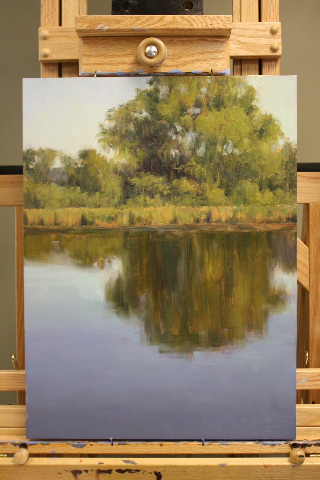 At this point, I'm getting close. So, I start slowing down quite a bit. Taking many breaks to keep my eye as fresh as possible. Always telling myself that each stroke at this point has to help the painting. If it hurts it, it's obvious not to put it in but if it doesn't hurt OR help, it's not necessary either. Easier said than done. I think this is about when I had to stop and go get my kids from school. Another good reason to have kids, keeps the eye fresh! ;)
 Awe, now for restraint! Tough when you like lily pads so much! They make me kinda happy so it's tough to stop when laying in the final notes which are symbols for lily pads. That was kind of like just taking 2 bites of cake when you have a huge piece in front of you! Just enough.
 Final
Final "Lily Pads And Blue Skies"
20x24
"Lily Pads And Blue Skies" are of the same place. My concept here is to paint this place from as many different perspectives possible. We'll see what happens!


