"White Lilacs"
20x24 oil on linen panel
Kami Polzin copyright 2010
The lilacs are early this year! I went into complete panic mode when returning home from painting Sarasota FLA last week to find the lilacs bushes blooming already. They don't last long, so everything else waited last week until this painting was completed. These are from my backyard (technically my neighbors bush). I had this composition in mind before even getting in the studio. The concept was that I wanted a rich warm background to highlight or support these beautiful whites.
 When setting up, I realized that this was going to need to be at least a 20x24 canvas. Since 20x24 was the largest canvas I had ready, that was the size it would be! I started off by using transparent oxide red to tone my board and then began laying out the composition and drawing, paying great attention to the movement and character of the bunch of lilacs. The movement, It matters tremendously!
Happy with the layout, I move on. . .
 As important as I knew it would be to get the flowers and foliage in ASAP (since they only had a day or 2 of life to them) I first needed to get at least my average of my background value/color massed in. The reason, color is relative! You cannot execute color until you have in at least an average of what it's going to be next to first
I then began massing in my structural darks (the foliage darks)
 I like to work up my painting as a whole as much as possible, I don't usually complete any one thing at once (not to say that's not a good way, it is, just not for me lately) I like to work up my painting as a whole because it seems to help me create harmony in my work. I then started to get the darks of my lilacs in (the shadow side) in this case as usual, cooler than the light side, making the whites somewhat blue.
 Continuing on getting a 20x24 covered, beginning to make notes of the difference in color temps and shifts in my large masses - And always correcting my drawing along the way! Painting is drawing, with marks of paint and temperature.
 At this point I'm starting to realize that I need to get my eyes away from the area I've been focusing so hard on, and I simply want to get an average color in on the foreground of my painting, still not entirely sure where I will go with this part. I only knew for sure that I wanted it to simply support the lilacs in a beautiful way.
 Finally I allow myself to begin massing in some light averages in the lilacs. I use great restraint when I build my paintings, what I mean by this is that as much as I want to put those fun lights in right away, I do my work first. :) Build build build!
 Now I'm thinking first, of my entire mass as a form and second, each lilac as individual forms that belong in the large mass. What I see most when I teach is that many painters don't understand form and how to achieve it. I think the biggest problem is lack of truly understanding it. I'm going to share this information on form with whoever might be interested, I realize that many painters reading this are masters in their own right of form but if this benefits even one painter, it's worth sharing. :)
 As important as I knew it would be to get the flowers and foliage in ASAP (since they only had a day or 2 of life to them) I first needed to get at least my average of my background value/color massed in. The reason, color is relative! You cannot execute color until you have in at least an average of what it's going to be next to first
I then began massing in my structural darks (the foliage darks)
 I like to work up my painting as a whole as much as possible, I don't usually complete any one thing at once (not to say that's not a good way, it is, just not for me lately) I like to work up my painting as a whole because it seems to help me create harmony in my work. I then started to get the darks of my lilacs in (the shadow side) in this case as usual, cooler than the light side, making the whites somewhat blue.
 Continuing on getting a 20x24 covered, beginning to make notes of the difference in color temps and shifts in my large masses - And always correcting my drawing along the way! Painting is drawing, with marks of paint and temperature.
 At this point I'm starting to realize that I need to get my eyes away from the area I've been focusing so hard on, and I simply want to get an average color in on the foreground of my painting, still not entirely sure where I will go with this part. I only knew for sure that I wanted it to simply support the lilacs in a beautiful way.
 Finally I allow myself to begin massing in some light averages in the lilacs. I use great restraint when I build my paintings, what I mean by this is that as much as I want to put those fun lights in right away, I do my work first. :) Build build build!
 Now I'm thinking first, of my entire mass as a form and second, each lilac as individual forms that belong in the large mass. What I see most when I teach is that many painters don't understand form and how to achieve it. I think the biggest problem is lack of truly understanding it. I'm going to share this information on form with whoever might be interested, I realize that many painters reading this are masters in their own right of form but if this benefits even one painter, it's worth sharing. :)
Think of this bunch of lilacs as a large ball. The ball is not flat, it come towards you in the front and gradually goes away from you as it 'rolls' away, it has FORM. As the forms moves (rolls) away from you, there will very likely be notably color/ temp. and value changes. This is what I am paying attention to in order to represent form and space in my painting, noting these changes with paint.
If this were a box, you would probably understand that the box has planes, each side is a plane, right? In a rounded form, such as this bunch of lilacs, it also contains planes, they are just much more subtle than a box. Being aware of this makes painting so much fun! Your eye will never seize to amaze you in what it sees!
 Still building on subtle notes of gradations.
 Working on correcting and working out some design issues with the foliage.
 Day 2: I spent most of the second day working on the vase and deciding how to handle the table top. At this stage, I had it too red. . .

 My set up.
 Still building on subtle notes of gradations.
 Working on correcting and working out some design issues with the foliage.
 Day 2: I spent most of the second day working on the vase and deciding how to handle the table top. At this stage, I had it too red. . .

 My set up.


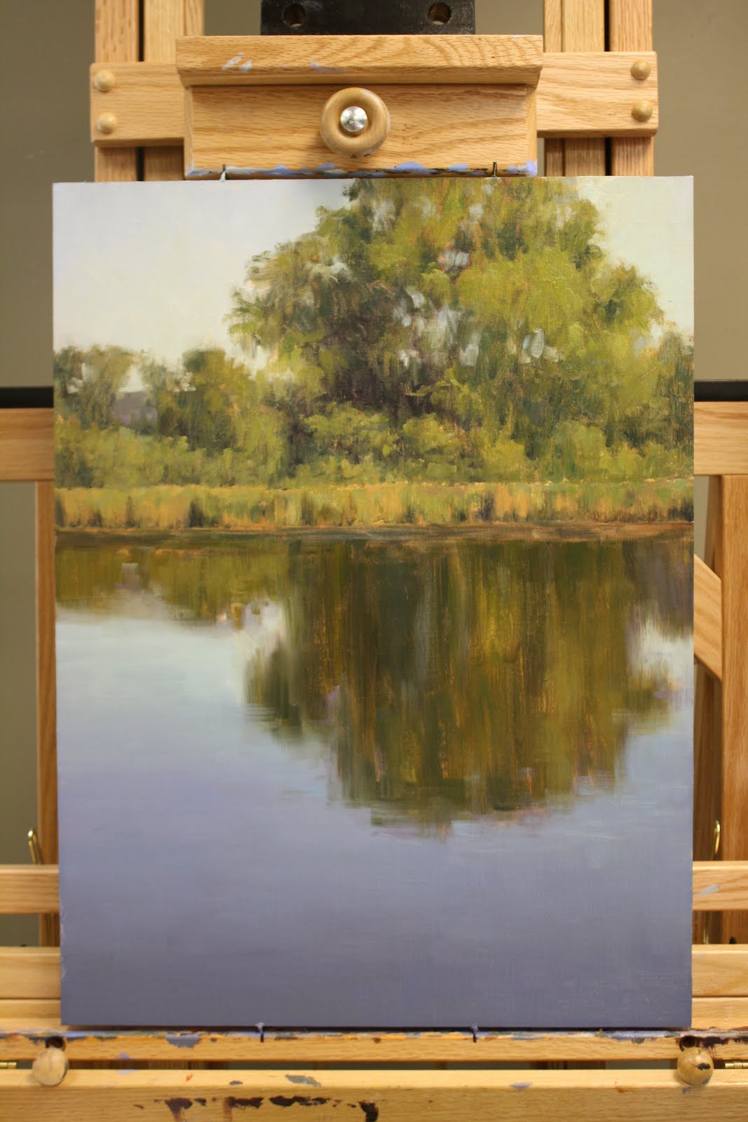
 This is the beginning stages of "Beaver Dam Island Reflections". I started out with a wash of transparent oxide red to map out my large shapes and where I wanted them to be placed. I believe I also used aliz. and viridian to map out my darks. I spend a lot of time thinking of how I best want to portray what it is I want to say in my painting. For me, It is critical to have a strong start in my paintings.